
Somehow Related : Links - Health
Do you see a relation between indices of health (such as Average Survival) in a country, and presence/ absence of war?
Play with this interactive map, and see what you think. Notice that since 1990 (first year represented here), generally ALL countries of the world have seen an increase in Average Survival figures. So even though "health" is distributed unevenly, (age 79 in US, age 46 in Malawi) as with many other resources, including Peace, overall things are improving, both within countries, and between countries. How does war impact on health, apart from a bullet? In many ways.
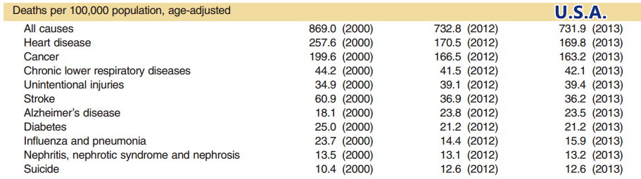
Compare these causes of death in the U.S.A. and Malawi :
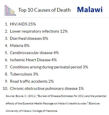
Are we just seeing things that were always there, but not being shown? And in a country so poor and unhealthy, why isn't suicide in the top 10 ?
Health, Education, Economics, Systems of Government, War : Are the first four, always causally related to the fifth? Can working on the first four, always prevent the fifth?
Here is another interactive map. It shows all diseases and their prevalence, by age and gender. Looks like stardust at first, but one can scroll in to enlarge, and click on a ball or star in this universe of disease, to get details. The larger the star, the higher the prevalence. This same prevalence data determine how the stars are clustered. Diseases somehow related, will tend to be clustered together on the map. For the teeny tiny stars, scroll in more closely to enlarge, then click on it more easily.